Showing posts with label Digital Painting. Show all posts

Sep 22, 2014

New Skins coming for WoW

I was definitely a latecomer, but I'm a big WoW fan and saw the new character skins that Blizzard is introducing with the new Warlords of Draenor Expansion this fall.  It inspired me to draw this guy.  A dark gray Tauren hunter was my first character that I fumbled along with.  Playing WoW on a cintiq feels a little more hands-on and fun (doesn't work perfectly, though).  Here's a little process shot too.  I'm working on gear for him that I'll post soon.

I'm a big fan of Moby Franke's work. He did the Team Fortress char designs for Valve as well as some awesome stuff for DOTA, and inspired the style choice on this one. 

Sep 4, 2013

Conflagration Cover

A book cover and banner I recently painted for the Brom inspired game and line of miniatures called Dark Age.  This was a bit of a short turn around, but was a lot of fun to work on.

Apr 22, 2013

Apr 21, 2013

The Tooth Ape


   The Tooth Ape, also known as the "Tooth Fairy Gorilla" is a distant relative of the contemporary Tooth Fairy.  While endowed with remarkable abilities and a well meaning spirit, she has a reputation for over zealous fits of passion.  Therefore children should be cautioned not to speak too openly of loose teeth in public places.

   This lovely character was dreamed up by my son at the dinner table last week.  I let the the kids art direct this one.

Mar 17, 2013

Angelina Studies!

Some mo grayscale head studies - this time with process shots to boot!

Mar 3, 2013

Only a Mother Could Love...


This is some SHANK2 fan art, kind of.  I never played the game, but saw the artwork and loved the character design, and animation style.  This character isn't actually in the game, it's sort of my own interpretation.  OK, I don't know what caused me to draw this.

ANTONIO BANDERAS!

Grayscale head studies.  Just tryin to get better at seeing values, breaking them down and keep a likeness too.  

Jan 1, 2013

May 31, 2012

Happy Self Portrait

Another self portrait from the mirror behind my computer.  I was happy with the last one even though I didn't look happy.  So I decided to give it another go - this time with a happy expression.  Those of you who know me may think that the earlier one is a better likeness, but that's only because I don't go around making this face.

Apr 29, 2012

Self Portrait

There is a mirror in front of my computer.  I filled one monitor with red and thought the color on my face was interesting, so I decided to do a little color study of myself.  Maybe I'll use it for my avatar.  You can see I like to work in a dark room.

Apr 3, 2012

Jack be Nimble...

This has been on my hard drive for over a year now.  It started out as an art challenge at the place I work -  do something based on the nursery rhyme "Jack be Nimble".  I knew what I wanted to do, but I kept going back and forth about the rabbit.  At one point he was a very large and sinister character, but it didn't fit.  I wanted him to be the turtle's peer, not a villain.  Originally I planned on making it look hyper-real like a 3d render, but my motivation to finish this to that degree after a year's time is gone.  Now I just want to get it out of the way, and move on to some of the images I'm more excited about finishing.  Below is the line art I did.  Hope you enjoy...

Mar 6, 2012

Sargent Study

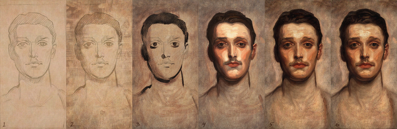
Here's another study I did using Art Rage (really love that program) and Photoshop.  This one turned out to be much more difficult than other master studies I've done.  Sargent makes it look so easy.  His portraits have this naturalness quality that you simply can't achieve unless you really slow down and look very carefully.  Besides the fact that I liked the painting as soon as I saw it, I picked this one because, one - it looked like a simple, fairly monochromatic straight-on portrait, and two - it had a lot of thin areas that I was eager to try and tackle.  Art Rage does the thick, impasto paint pretty well, but the thin areas are hard to mimic.  But boy was I wrong about this being an easy study.
Here is a rather rough progression and a detail.  I started with Art Rage and worked back and forth with Photoshop to get the canvas wash satisfactory.  In hindsight, I should have done the initial sketch and block-in with the darks (stages 1 and 3) more carefully instead of rushing in with the heavy paint thinking I could just fix it all later.  I had to do a lot more correcting of the drawing in the later stages because of that.  Overall this was a humbling experience.  You can see the image I was working from here:  http://muddycolors.blogspot.com/2012/01/art-might-online-art-museum.html

And here are some figure drawings from  a week ago.  1 mins, 10mins, and 20 min I think.

Jun 12, 2011

More studies from Leyendecker studies

Still learning from doing these, and enjoying it too.
Photoshop CS5.  I used mostly just two brushes to do these, but I put a little texture and a simple emboss effect on the highlights to give them more of the look of real oil paint.  Real oil on canvas has some body or thickness to it so it casts a little shadow on the canvas.

Apr 29, 2011

Digital Painting Exercises

   These are a bit old, but I still like them.  The first is a painting loosely based off of a great photo I came across of Vladimir Putin.  I wasn't so interested in trying to do a painting of Putin as much as I was in the  dramatic lighting and color.  Plus I wanted to try out some new brushes I created and to try and get closer to a natural, traditional media look with Photoshop CS3.
   The second is a study of one of Scott Burdick's paintings.  This time using ArtRage 2.0 on a Cintiq, I tried to see how close I could get to the look and feel of real oil on canvas.  If you're not familiar with the work of Scott Burdick and his wife, Susan Lyon, it is well worth checking out.

Mar 9, 2011

JC Leyendecker Hands

  My wife bought me a great book on the life and work of JC Leyendecker (1874 - 1951) for Christmas last year.  I've been a huge fan of his work since the first time I saw it back in college.  His paintings are so clean and well designed, and he made it look so effortless.  Unlike Norman Rockwell and many of the illustrators that followed him, he did not use photo reference at all, but did careful studies of props and models from life for each of the illustrations he created. I decided to do regular studies of his work in hopes to unlock some of secrets hidden in his flawless technique and better understand his thought process.

  Leyendecker was a master at painting hands full of character and personality.  In doing this study from one of his preparatory paintings, I could see just how much he utilized the ground as a mid tone to work back and forth with darks and lights.  The ground is a light gray and since he keeps the shadows thin, the overall effect is very luminous - a hallmark of his paintings.
  Anyway, the top image above is the study I did, and a process sequence.  The painting was done with Photoshop CS3.  The bottom image is the Leyendecker study I was working from.